
Tailwind CSS
提示
Tailwind CSS 版本:3.4.17
第一章:初识
一、概述
1. 是什么
一个实用至上的 CSS 原子框架,包含了大量类似 flex、 pt-4、 text-center 以及 rotate-90 等工具类,可以组合使用并直接在 HTML 代码上实现任何 UI 设计。让你无需离开 HTML 即可快速构建现代网站。
参考文档
官方文档:Tailwind CSS
中文文档:Tailwind CSS | Nodejs.cn 旗下网站
2. 好处
这是一种与传统“语义化 CSS”截然不同的思路,它提供了一系列高度可组合的、功能单一的“原子类” (Atomic CSS / Utility Classes) 。
核心思想:你不再为组件编写专门的 CSS 类,而是直接在 HTML 中组合这些原子类来构建样式。
优势:
- 无需思考命名:从根本上消除了为 class 命名的烦恼。
- 无需切换文件:样式和结构在一起,开发心流不被打断。
- 极致的性能:通过 PurgeCSS 等工具,在构建时扫描你的文件,只将用到的原子类打包到最终的 CSS 文件中,体积通常只有几 KB。
- 约束与一致性:所有样式都来自预设的 design tokens (在
tailwind.config.js中定义) ,保证了整个项目视觉上的一致性。
3. 工作原理
Tailwind CSS 本质上是一个 PostCSS 插件,结合了 PostCSS 的处理能力和 Tailwind 特有的生成逻辑:
扫描项目文件
   ↓
提取 Tailwind CSS 类名
   ↓
匹配配置 (tailwind.config.js)
   ↓
生成原子化 CSS
   ↓
输出到最终的 CSS 文件中4. 快速入门
1)Tailwind CLI
[1] 安装 Tailwind CSS
mkdir demo
cd demo

npm init -y

# 安装 tailwindcss
npm install -D tailwindcss
# 初始化会生成 tailwind.config.js 配置文件
npx tailwindcss init[2] 编辑 /tailwind.config.js 配置文件
module.exports = {
 content: ["./src/**/*.{html,js}"],
 theme: {
   extend: {},
 },
 plugins: [],
}[3] 添加 Tailwind 样式指令到 @/input.css 文件中
@tailwind base; /* 消除跨浏览器的不一致。当在 CSS 中包含 `@tailwind base` 时,Tailwind 会自动注入这些样式 */
@tailwind components;
@tailwind utilities;[4] 使用 Tailwind Cli 构建 CSS 样式
npx tailwindcss -i ./src/input.css -o ./src/output.css --watch该命令会将 @/input.css 中 Tailwind CSS 编译到 demo/src/output.css 文件中,output.css 就是编译后的样式文件,项目中引入的就是它。
[5] 使用
@/index.html
<!doctype html>
<html>
<head>
  <meta charset="UTF-8">
  <meta name="viewport" content="width=device-width, initial-scale=1.0">
  <link href="./output.css" rel="stylesheet">
</head>
<body>
  <h1 class="text-3xl font-bold underline">
    Hello world!
  </h1>
</body>
</html>2)vite 中使用
[1] 创建 vite 项目
npm create vite@latest my-project -- --template vue[2] npm 安装 Tailwind CSS
npm install -D tailwindcss@3 postcss autoprefixer[3] 生成 tailwind.config.js 文件
npx tailwindcss init -p[4] 配置 tailwind
/** @type {import('tailwindcss').Config} */
export default {
  content: [
    "./index.html",
    "./src/**/*.{vue,js,ts,jsx,tsx}",
  ],
}[5] 导入 Tailwind CSS 在 style.css 文件中
@tailwind base;
@tailwind components;
@tailwind utilities;4)在 vue 组件中使用 Tailwind
<!-- App.vue -->
<template>
  <h1 class="text-3xl font-bold underline">
    Hello world!
  </h1>
</template>3)框架中使用
Nuxt 中使用:Install Tailwind CSS with Nuxt
Next.js 中使用:Install Tailwind CSS with Next.js
二、使用必知
1. IDE 代码提示
Visual Studio Code 安装 Tailwind CSS IntelliSense 插件。
JetBrains IDE 默认就支持,不需要安装任何插件。具体参考 Tailwind CSS | WebStorm 文档。
此外 Tailwind CSS 官方还维护了一个官方 Prettier 插件,用来格式化类排序。
2. 使用预处理器
Tailwind 官方的建议
- 用
postcss-import替代预处理器的@import - 用
postcss-nested替代预处理器的嵌套 - 用 Tailwind 的
theme()替代预处理器的变量 - 用 PostCSS 插件替代预处理器的函数
1)使用 PostCSS 作为预处理器
[1] 构建时导入
使用 PostCSS 处理此问题的规范插件是 postcss-import。
npm install -D postcss-import使用插件
// postcss.config.js
module.exports = {
  plugins: {
    'postcss-import': {},
    tailwindcss: {},
    autoprefixer: {},
  }
}
postcss-import需要注意的一件重要事情是它严格遵守 CSS 规范并且不允许在文件的最顶部以外的任何地方使用@import语句。
[2] 嵌套
使用 tailwindcss/nesting 插件。它是一个 PostCSS 插件,它封装了 postcss-nested 或 postcss-nesting 并充当兼容层。
它直接包含在 tailwindcss 包本身中,所以要使用它,你需要做的就是将它添加到你的 PostCSS 配置中。
// postcss.config.js
module.exports = {
  plugins: {
    'postcss-import': {},
    'tailwindcss/nesting': {},
    tailwindcss: {},
    autoprefixer: {},
  }
}默认情况下,它使用引擎盖下的 postcss-nested 插件,它使用类似 Sass 的语法。如果更愿意使用 postcss-nesting(基于标准 CSS 嵌套 规范),请首先安装插件:
npm install -D postcss-nesting然后将插件本身作为参数传递给 PostCSS 配置中的 tailwindcss/nesting:
// postcss.config.js
module.exports = {
  plugins: {
    'postcss-import': {},
    'tailwindcss/nesting': 'postcss-nesting',
    tailwindcss: {},
    autoprefixer: {},
  }
}请注意,如果你在项目中使用 postcss-preset-env,则应确保禁用嵌套并让 tailwindcss/nesting 为你处理:
// postcss.config.js
module.exports = {
  plugins: {
    'postcss-import': {},
    'tailwindcss/nesting': 'postcss-nesting',
    tailwindcss: {},
    'postcss-preset-env': {
      features: { 'nesting-rules': false },
    },
  }
}[3] 变量
直接使用 CSS 变量语法。因为浏览器本身就支持。
[4] 浏览器前缀
npm install -D autoprefixerautoprefixer 一定要写在 PostCSS 配置中插件列表的最后。
module.exports = {
  plugins: {
    tailwindcss: {},
    autoprefixer: {},
  }
}2)使用 Sass、Less 或 Stylus
推荐不要在 Tailwind 项目中使用 Sass 或 Less 等预处理器。
若非要 Tailwind 与预处理器一起使用,需要知道一点,Sass、Less 和 Stylus 等预处理器要在 Tailwind 之前单独运行。
# 正常的 Tailwind 构建流程 (推荐)
CSS 文件 → PostCSS (含 Tailwind) → 输出 CSS

# 使用 Sass/Less 时的构建流程 (复杂)
SCSS 文件 → Sass 编译器 → CSS → PostCSS (含 Tailwind) → 输出 CSS
   ↑          第一步              ↑        第二步
你写的代码 中间产物第二章:核心概念
一、夜间模式
1. 自动感知
Tailwind 会自动感知用户操作系统的暗色 / 亮色主题设置。当在代码中使用 dark 变体后,Tailwind 会根据用户设置的主题来决定是否使用 dark 修饰符设置的样式。
<!--
  默认背景颜色为白色, 字体颜色为黑色
  当用户启用了夜间模式, 就会使用 dark 修饰符所指定的样式
-->
<div class="bg-white dark:bg-slate-800">
  <h3 class="text-slate-900 dark:text-white">《巴黎圣母院》</h3>
  <p class="text-slate-500 dark:text-slate-400">
    这是黄昏的太阳,我们却把它当成了黎明的曙光。
  </p>
</div>2. 手动切换夜间模式
1)默认选择器
如果你想支持手动切换夜间模式而不是依赖于操作系统偏好,请使用 selector 策略而不是 media 策略。
// tailwind.config.js
module.exports = {
  darkMode: 'selector',
  // ...
}现在只要 dark 类出现在 HTML 树中较早的位置,就会应用它们。
<!-- 深色模式未启用 -->
<html>
<body>
  <!-- 将使用白色背景 -->
  <div class="bg-white dark:bg-black">
    <!-- ... -->
  </div>
</body>
</html>

<!-- 深色模式启用 -->
<html class="dark">
<body>
  <!-- 将使用黑色背景 -->
  <div class="bg-white dark:bg-black">
    <!-- ... -->
  </div>
</body>
</html>如何将 dark 类添加到 html 元素取决于你,但常见的方法是使用一些 JavaScript 从某处(如 localStorage)读取首选项并相应地更新 DOM。
2)自定义选择器
不想在最早的 DOM 中设置 class="dark" 来开启,想修改 class="dark" 为其他值,怎么办?
可以通过将 darkMode 设置为数组并将自定义选择器作为第二项来自定义夜间模式选择器:
// tailwind.config.js
module.exports = {
  darkMode: ['selector', '[data-mode="dark"]'],
  // ...
}这样触发深色模式方式就改为了:
<html data-mode="dark">
<body>
  <!-- 将使用黑色背景 -->
  <div class="bg-white dark:bg-black">
    <!-- ... -->
  </div>
</body>
</html>3. 默认夜间模式
官网这部分称为覆盖黑暗变体,该怎么理解?一句话就是之前默认是日间模式,但如果使用了覆盖黑暗变体就变为了默认夜间模式。
// tailwind.config.js
module.exports = {
  darkMode: ['variant', '&:not(.light *)'], // 只要 class 没有 light 选择器, 就是浅色模式, 否则深色模式
  // ...
}同样支持多个选择器。
/** @type {import('tailwindcss').Config} */
module.exports = {
  darkMode: ['variant', [
    '@media (prefers-color-scheme: dark) { &:not(.light *) }',
    '&:is(.dark *)',
  ]],
  // ...
}4. 实战案例
1)React 示例
ThemeProvider 组件
// ThemeProvider.tsx
import { createContext, useContext, useEffect, useState } from 'react';

const ThemeContext = createContext<{
  theme: 'light' | 'dark';
  toggleTheme: () => void;
}>({ theme: 'light', toggleTheme: () => {} });

export function ThemeProvider({ children }: { children: React.ReactNode }) {
  const [theme, setTheme] = useState<'light' | 'dark'>('light');

  useEffect(() => {
    // 初始化主题
    const savedTheme = localStorage.getItem('theme') as 'light' | 'dark';
    if (savedTheme) {
      setTheme(savedTheme);
      document.documentElement.setAttribute('data-theme', savedTheme);
    }
  }, []);

  const toggleTheme = () => {
    const newTheme = theme === 'dark' ? 'light' : 'dark';
    setTheme(newTheme); // 修改 state
    // 修改 DOM
    if(newTheme == 'dark') {
      document.documentElement.setAttribute('data-theme', newTheme);
    }else {
      document.documentElement.removeAttribute('data-theme');
    }
    localStorage.setItem('theme', newTheme); // 修改 localStorage
  };

  return (
    <ThemeContext.Provider value={{ theme, toggleTheme }}>
      {children}
    </ThemeContext.Provider>
  );
}

export const useTheme = () => useContext(ThemeContext);使用
切换按钮回调事件
function ThemeToggle() {
  const { theme, toggleTheme } = useTheme();

  return (
    <button onClick={toggleTheme}>
      {theme === 'dark' ? '🌙' : '☀️'}
    </button>
  );
}2)支持系统偏好和手动选择
[1] 核心逻辑
页面加载时的判断逻辑
// 在页面加载或更改主题时,最好在 `<head>` 中内联添加,以避免 FOUC
document.documentElement.classList.toggle(
  'dark',  // ← 要切换的类名

  // ← 判断条件 (满足任一即添加 dark 类)
  localStorage.theme === 'dark' ||  // 条件1: 用户手动选了暗色
  (
    !('theme' in localStorage) &&   // 条件2: 用户没有手动选择
    window.matchMedia('(prefers-color-scheme: dark)').matches  // 且系统是暗色
  )
)用户操作
// 用户手动选择亮色
localStorage.theme = 'light'
document.documentElement.classList.remove('dark')

// 用户手动选择暗色
localStorage.theme = 'dark'
document.documentElement.classList.add('dark')

// 用户选择"跟随系统"
localStorage.removeItem('theme') // 删除主题设置
// 然后重新运行判断逻辑
document.documentElement.classList.toggle(
  'dark',
  window.matchMedia('(prefers-color-scheme: dark)').matches
)[2] React/Next.js 实现
ThemeProvider 组件
// contexts/ThemeContext.tsx
import { createContext, useContext, useEffect, useState } from 'react';

type Theme = 'light' | 'dark' | 'system';

const ThemeContext = createContext<{
  theme: Theme;
  setTheme: (theme: Theme) => void;
}>({
  theme: 'system',
  setTheme: () => {},
});

export function ThemeProvider({ children }: { children: React.ReactNode }) {
  const [theme, setTheme] = useState<Theme>('system');

  useEffect(() => {
    // 初始化主题
    const savedTheme = localStorage.getItem('theme') as Theme;
    if (savedTheme === 'light' || savedTheme === 'dark') {
      setTheme(savedTheme);
    } else {
      setTheme('system');
    }
  }, []);

  useEffect(() => {
    const applyTheme = () => {
      const isDark =
        theme === 'dark' ||
        (theme === 'system' && window.matchMedia('(prefers-color-scheme: dark)').matches);

      document.documentElement.classList.toggle('dark', isDark);
    };

    applyTheme();

    // 监听系统主题变化
    const mediaQuery = window.matchMedia('(prefers-color-scheme: dark)');
    const handleChange = () => {
      if (theme === 'system') {
        applyTheme();
      }
    };

    mediaQuery.addEventListener('change', handleChange);
    return () => mediaQuery.removeEventListener('change', handleChange);
  }, [theme]);

  const handleSetTheme = (newTheme: Theme) => {
    setTheme(newTheme);

    if (newTheme === 'light' || newTheme === 'dark') {
      localStorage.setItem('theme', newTheme);
    } else {
      localStorage.removeItem('theme');
    }
  };

  return (
    <ThemeContext.Provider value={{ theme, setTheme: handleSetTheme }}>
      {children}
    </ThemeContext.Provider>
  );
}

export const useTheme = () => useContext(ThemeContext);主题切换组件
// components/ThemeToggle.tsx
import { useTheme } from '@/contexts/ThemeContext';

export function ThemeToggle() {
  const { theme, setTheme } = useTheme();

  return (
    <div className="flex gap-2">
      <button
        onClick={() => setTheme('light')}
        className={`px-4 py-2 rounded ${
          theme === 'light' ? 'bg-blue-500 text-white' : 'bg-gray-200'
        }`}
      >
        ☀️ 亮色
      </button>

      <button
        onClick={() => setTheme('dark')}
        className={`px-4 py-2 rounded ${
          theme === 'dark' ? 'bg-blue-500 text-white' : 'bg-gray-200'
        }`}
      >
        🌙 暗色
      </button>

      <button
        onClick={() => setTheme('system')}
        className={`px-4 py-2 rounded ${
          theme === 'system' ? 'bg-blue-500 text-white' : 'bg-gray-200'
        }`}
      >
        🖥️ 自动
      </button>
    </div>
  );
}二、函数和指令
1. 指令
1)@tailwind
导入 tailwind 提供的样式。
@tailwind xxx2)@layer
为什么 Tailwind 将样式分组为 “layers”?
在 CSS 中,当两个选择器具有相同的特异性时,样式表中规则的顺序决定了哪个声明获胜:
.btn {
  background: blue;
  /* ... */
}

.bg-black {
  background: black;
}在这里,两个按钮都是黑色的,因为 .bg-black 在 CSS 中位于 .btn 之后:
<button class="btn bg-black">...</button>
<button class="bg-black btn">...</button>为了解决这个问题,Tailwind 将其生成的样式组织成三个不同的 “layers” — 这是 ITCSS 推广的概念。
- base 层用于重置规则或应用于纯 HTML 元素的默认样式。
- components 层用于你希望能够使用工具覆盖的基于类的样式。
- utilities 层用于小型、单一用途的类,这些类应始终优先于任何其他样式。
明确这一点可以更容易地理解你的样式将如何相互交互,并且使用 @layer 指令可以让你控制最终的声明顺序,同时仍然以你喜欢的任何方式组织你的实际代码。
@tailwind base;
@tailwind components;
@tailwind utilities;

@layer base {
  h1 {
    @apply text-2xl;
  }
  h2 {
    @apply text-xl;
  }
}

/* ... */好处:自动摇树、在使用这些类的时候可以用修饰符。
3)@apply
基本使用
当自己编写 css 样式时,可以通过 @apply 来使用 tailwind 的原子类。
.search {
  @apply border border-gray-300 rounded;
}

.bar {
  @apply search;
}!important 使用注意事项
任何与 @apply 内联的规则都将删除 !important。
/* Input */
.foo {
  color: blue !important;
}

.bar {
  @apply foo;
}

/* Output */
.foo {
  color: blue !important;
}

.bar {
  color: blue;
}如果你想 @apply 现有类并将其变为 !important,只需将 !important 添加到声明的末尾:
/* Input */
.btn {
  @apply font-bold py-2 px-4 rounded !important;
}

/* Output */
.btn {
  font-weight: 700 !important;
  padding-top: .5rem !important;
  padding-bottom: .5rem !important;
  padding-right: 1rem !important;
  padding-left: 1rem !important;
  border-radius: .25rem !important;
}如果你使用的是 Sass/SCSS,则需要使用 Sass 的插值功能才能使其正常工作:
.btn {
  @apply font-bold py-2 px-4 rounded #{!important};
}2. 函数
1)theme()
使用 theme() 函数通过点表示法访问你的 Tailwind 配置值。
.content-area {
  height: calc(100vh - theme(spacing.12));
  height: calc(100vh - theme(spacing.[2.5]));

  background-color: theme(colors.blue.500);
  background-color: theme(colors.blue.500 / 75%);
}三、添加自定义样式
1. class 属性上编写内联样式
1)任意值
在工具类上使用 []。
<div class="grid grid-cols-[fit-content(theme(spacing.32))] bg-[--my-color] lg:top-[344px]">
  <!-- ... -->
</div>2)任意属性
可以用方括号 [] 直接写任意 CSS 属性。
<div class="[display:grid] [grid-template-columns:1fr] md:[grid-template-columns:1fr_1fr]">
  <!--
    默认等同于 CSS 样式为 display: grid;
    手机是 1 列, 平板及其以上是 2 列
  -->
</div>这跟内联样式相似,但好处是可以使用修饰符:
<div class="[mask-type:luminance] hover:[mask-type:alpha]">
  <!-- ... -->
</div>这对于 CSS 变量之类的东西也很有用,尤其是当它们需要在不同条件下更改时:
<div class="[--scroll-offset:56px] lg:[--scroll-offset:44px]">
  <!-- ... -->
</div>3)任意变体
可以用方括号 [] 直接写任意 CSS 选择器或伪类来创建自定义修饰符。具体格式:[selector]:{utility}
<!--
  lg:[&:nth-child(3)]:hover:underline
  │   │                │      └─ 工具类: 添加下划线
  │   │                └─ 内置修饰符: 悬停时
  │   └─ 任意变体 / 自定义的修饰符: 当是第3个子元素时
  └─ 响应式修饰符: 大屏幕时

  大白话: 在大屏幕上, 第3个 <li> 元素在悬停时显示下划线
-->
<li class="lg:[&:nth-child(3)]:hover:underline">
  项目
</li>4)注意点
处理空格
当任意值需要包含空格时,请改用下划线 (_),Tailwind 会在构建时自动将其转换为空格:
<div class="grid grid-cols-[1fr_500px_2fr]">
  <!-- ... -->
</div>Tailwind 很智能,比如在 <div class="bg-[url('/what_a_rush.png')]"> 场景下,就不会把下划线转为空格。
有些时候,就是想保留下划线,可以使用反斜杠转义。但在 JSX 中反斜杠会从渲染的 HTML 中剥离,这时请使用 String.raw(),反斜杠就不会被视为 JavaScript 转义字符:
<div class="before:content-['hello\_world']">
  <!-- ... -->
</div>

<div className={String.raw`before:content-['hello\_world']`}>
  <!-- ... -->
</div>解决歧义
Tailwind 中的许多工具共享一个公共命名空间,但映射到不同的 CSS 属性。例如 text-lg 和 text-black 都共享 text- 命名空间,但一个用于 font-size,另一个用于 color。
但若使用任意值 <div class="text-[var(--my-var)]">,Tailwind 就不知道使用哪个命名空间了,怎么办?可以通过在值前添加 CSS 数据类型。
<!-- Will generate a font-size utility -->
<div class="text-[length:var(--my-var)]">...</div>

<!-- Will generate a color utility -->
<div class="text-[color:var(--my-var)]">...</div>2. 使用 CSS 和 @layer
四、变体 / 修饰符 / 选择器
1. 伪类
1)动态伪类
hover、focus 和 active 修饰符在悬停、聚焦和活动元素上设置样式。
<!--
  鼠标悬停到 button 上, 背景颜色改为 bg-violet-600
  单击 button 不松时, active 与 focus 样式都激活
  当松手并离开 button 时, 只有 focus 样式激活
-->
<button class="bg-violet-500 hover:bg-violet-600 active:bg-violet-700 focus:outline-none focus:ring focus:ring-violet-300">
  Save changes
</button>2)结构伪类
first 和 last
<!-- 移除第一个/最后一个孩子时的顶部/底部填充 -->
<li class="py-4 first:pt-0 last:pb-0">
  <!-- ... -->
</li>odd 和 even 分别为奇数、偶数。
<table>
  <!-- ... -->
  <tbody>
    <!-- 奇数行使用白色背景, 偶数行使用 slate-50 -->
    <tr class="odd:bg-white even:bg-slate-50">
      <td>...</td>
      <td>...</td>
    </tr>
  </tbody>
</table>3)UI 元素伪类
使用 required、invalid 和 disabled 等修饰符为不同状态的表单元素设置样式。
invalid 是表单校验不通过展示的样式。校验不通过?难道 input 标签自带校验!?没错,H5 新增了 type 为 email、url 等。
4)结构状态伪类
基于父状态的样式 (group-{modifier}
当需要根据某个父元素的状态来设置元素的样式时,用 group 类标记父元素,并使用 group-hover 等 group-* 修饰符来设置目标元素的样式。
<!--
  当悬停在 a 标签之上时, 给 svg 图片颜色改为白色、h3 文字颜色改为白色、p 文字颜色改为白色
-->
<a href="#" class="group">
  <svg class="group-hover:stroke-white"><!-- ... --></svg>
  <h3 class="group-hover:text-whit">New project</h3>
  <p class="group-hover:text-white">Create a new project from a variety of starting templates.</p>
</a>区分嵌套组:嵌套组时,可以根据特定父组的状态设置样式,方法是使用 group/{name} 类为该父组指定一个唯一的组名称,并使用 group-hover/{name} 类在修饰符中包含该名称。
基于兄弟状态的样式 (peer-{modifier})
当需要根据同级元素的状态设置元素样式时,请使用 peer 类标记同级元素,并使用 peer-invalid 等 peer-* 修饰符来设置目标元素的样式。
<!--
  当 input 校验不通过时, p 元素显示
-->
<input type="email" class="peer"/>
<p class="invisible peer-invalid:visible">
  Please provide a valid email address.
</p>区分同行:使用多个节点时,可以通过使用 peer/{name} 类为该节点赋予唯一名称,并使用 peer-checked/{name} 等类将该名称包含在修饰符中,从而根据特定节点的状态设置样式。
<!--
  当 Draft 单选框勾选时, Draft 文字变为蓝色, 且显示 Drafts are only visible ... 文字
  当 Published 单选框勾选时, Published 文字变为蓝色, 且显示 Your post will be publicly visible ... 文字
-->
<fieldset>
  <legend>Published status</legend>

  <input id="draft" class="peer/draft" type="radio" name="status" checked />
  <label for="draft" class="peer-checked/draft:text-sky-500">Draft</label>

  <input id="published" class="peer/published" type="radio" name="status" />
  <label for="published" class="peer-checked/published:text-sky-500">Published</label>

  <div class="hidden peer-checked/draft:block">Drafts are only visible to administrators.</div>
  <div class="hidden peer-checked/published:block">Your post will be publicly visible on your site.</div>
</fieldset>直接子级的样式 (*-{modifier})
基于后代的样式 (has-{modifier})
使用 has-* 修饰符根据其后代的状态或内容设置元素的样式。
<!-- 这个 input 单选框是否勾选, 如果勾选了, 就应用这些样式 -->
<label class="has-[:checked]:bg-indigo-50 has-[:checked]:text-indigo-900 has-[:checked]:ring-indigo-200 ..">
  Google Pay
  <input type="radio" class="checked:border-indigo-500" />
</label>基于群组后代的样式 (group-has-{modifier})
如果需要基于父元素的后代元素设置样式,可以使用 group 类标记父元素,并使用 group-has-* 修饰符设置目标元素的样式。
<!-- 此 div 元素中是否有 a 元素, 若有则显示 SVG 图标 -->
<div class="group">
  <p>Product Designer at <a href="http://127.0.0.1">planeteria.tech</a></p>
  <svg class="hidden group-has-[a]:block ..."><!-- ... --></svg>
</div>基于对等后代的样式 (peer-has-{modifier})
如果需要基于同级元素的后代元素设置样式,可以使用 peer 类标记同级,并使用 peer-has-* 修饰符设置目标元素的样式。
<!-- peer 下的多选框是否勾选, 若勾选则隐藏 SVG 图标 -->
<fieldset>
  <legend>Today</legend>
  <div>
    <label class="peer">
      <input type="checkbox" checked />
      吸烟 喝酒 烫头
    </label>
    <svg class="peer-has-[:checked]:hidden">
      <!-- ... -->
    </svg>
  </div>
  <!-- ... -->
</fieldset>2. 伪元素
1)before 和 after
使用 before 和 after 修饰符设置 ::before 和 ::after 伪元素的样式。
<!-- 给 Email 文字后加 * -->
<label class="block">
  <span class="after:content-['*'] after:ml-0.5 after:text-red-500">
    Email
  </span>
  <input type="email" name="email" />
</label>2)input 占位符文本样式
使用 placeholder 修饰符设置任何输入或文本区域的占位符文本的样式。等价于 CSS 中的 E::placeholder 选择器。
3)文件输入按钮
使用 file 修饰符在文件输入中设置按钮样式。
注意:要向文件 input 修饰边框,需要加上 file 修饰符才行。
<input type="file" class="file:border file:border-solid" />4)列表标记
使用 marker 修饰符在列表中设置计数器或项目符号的样式。
<!-- 列表标记颜色为 sky-400 -->
<ul class="marker:text-sky-400 list-disc pl-5 space-y-3 text-slate-500">
  <li>5 cups chopped Porcini mushrooms</li>
  <li>1/2 cup of olive oil</li>
  <li>3lb of celery</li>
</ul>注意:tailwind 把此修饰符设计为可继承。
5)高亮的文本
使用 selection 修饰符设置活动文本选择的样式。等价于 CSS 中的 E::selection 选择器。
注意:tailwind 把此修饰符设计为可继承。
6)首行和首字母
使用 first-line 修饰符设置内容块中第一行的样式。等价于 CSS 中的 E::first-line 选择器。
使用 first-letter 修饰符设置第一个字母的样式。等价于 CSS 中的 E::first-letter 选择器。
7)对话框背景
使用 backdrop 修饰符设置 原生 <dialog> 元素 的背景样式。
<dialog class="backdrop:bg-gray-50">
  <form method="dialog">
    <!-- ... -->
  </form>
</dialog>4.
5.
第三章:排版
一、字体
1. font-style
| 类 | 属性 |
|---|---|
| italic | font-style: italic; |
| not-italic | font-style: normal; |
2. font-variant
3. font-weight
1)内置工具类
使用 font-* 工具来控制元素的字体粗细。
| 类 | 属性 |
|---|---|
| font-normal | font-weight: 400; |
| font-bold | font-weight: 700; |
* 的其他取值可参考官方文档。
2)使用自定义值
任意值
font-[<value>] ==> font-weight: <value>;
4. font-size 与 line-height
1)内置工具类
设置字体大小
使用
text-*工具来控制元素的字体大小。类 属性 text-sm font-size: 0.875rem;
line-height: 1.25rem;text-base font-size: 1rem;
line-height: 1.5rem;text-lg font-size: 1.125rem;
line-height: 1.75rem;text-xl font-size: 1.25rem;
line-height: 1.75rem;text-2xl font-size: 1.5rem;
line-height: 2rem;*的其他取值可参考官方文档。设置行高
在设置字体大小的同时设置元素的行高,例如,使用
text-xl/8设置字体大小为1.25rem,行高为2rem。
2)使用自定义值
任意值
text-[<value>] ==> font-size: <value>;
5. line-height
1)内置工具类
相对行高
使用
leading-none、leading-tight、leading-snug、leading-normal、leading-relaxed和leading-loose工具根据元素的当前字体大小为元素提供相对行高。固定行高
使用
leading-6和leading-7等工具为元素提供固定的行高,而不管当前的字体大小如何。
2)使用自定义值
任意值
leading-[<value>] ==> line-height: <value>;
3)注意
<!--
  默认情况下 (在手机屏幕), 字体大小与行高使用 text-lg, 但 text-lg 中的行高被 leading-loose 覆盖
  在电脑屏下 (md 断点), 字体大小与行高都会使用 text-xl
-->
<p class="text-lg leading-loose md:text-xl">
  Maybe we can live without libraries...
</p>现在就想在在电脑屏 (md 断点) 下使用 leading-loose 行高,需要添加 md:leading-loose 工具类。
<p class="text-lg leading-loose md:text-xl md:leading-loose">
  Maybe we can live without libraries...
</p>6. font-family
1)内置工具类
| 类 | 属性 |
|---|---|
| font-sans | font-family: ui-sans-serif, system-ui, sans-serif, "Apple Color Emoji", "Segoe UI Emoji", "Segoe UI Symbol", "Noto Color Emoji"; |
| font-serif | font-family: ui-serif, Georgia, Cambria, "Times New Roman", Times, serif; |
| font-mono | font-family: ui-monospace, SFMono-Regular, Menlo, Monaco, Consolas, "Liberation Mono", "Courier New", monospace; |
2)使用自定义值
任意值
font-[<value>] ==> font-family: <value>;
自定义默认字体
tailwind 默认会把 fontFamily.sans 值添加到 html 元素上,因此可以用于更改项目默认字体。
const defaultTheme = require('tailwindcss/defaultTheme')

module.exports = {
  theme: {
    extend: {
      fontFamily: {
        'sans': ['"Proxima Nova"', ...defaultTheme.fontFamily.sans],
      },
    }
  }
}第二种方案:
@tailwind base;
@tailwind components;
@tailwind utilities;

@layer base {
  html {
    font-family: "Proxima Nova", system-ui, sans-serif;
  }
}3)自定义主题
// tailwind.config.js
module.exports = {
  theme: {
    fontFamily: {
      'sans': ['ui-sans-serif', 'system-ui', ...],
      'serif': ['ui-serif', 'Georgia', ...],
      'mono': ['ui-monospace', 'SFMono-Regular', ...],
      'display': ['Oswald', ...],
      'body': ['"Open Sans"', ...],
    }
  }
}如果字体名有空格,需要这样才行。
/* 第一种解决办法【推荐】 */
'sans': ['"Exo 2"', ...],

/* 第二种解决办法 */
'sans': ['Exo\\ 2', ...],二、文本
1. color
1)内置工具类
设置文本颜色
类 解释 属性 text-*
例子:text-black* 可取值为 tailwindcss 设置的颜色关键字。 color: rgb(0 0 0 / var(--tw-text-opacity, 1)); text-*-* 第二个 * 为颜色亮度等级,数值越大,颜色越深,反之颜色越浅。 改变透明度
使用颜色透明度修饰符来控制元素文本颜色的透明度。例子:
html<!-- 使用 opacity-* 工具类定义的值 --> <p class="text-blue-600/100">The quick brown fox...</p> <!-- 使用任意值 --> <p class="text-blue-600/[.06]">The quick brown fox...</p>
2)使用自定义值
任意值
text-[<value>] ==> color: <value>;
2. text-align
| 类 | 属性 |
|---|---|
| text-left | text-align: left; |
| text-center | text-align: center; |
| text-right | text-align: right; |
| text-justify | text-align: justify; |
| text-start | text-align: start; |
| text-end | text-align: end; |
3. text-decoration
1)修饰线位置
| 类 | 解释 | 属性 |
|---|---|---|
| underline | 下划线 | text-decoration-line: underline; |
| overline | 上划线 | text-decoration-line: overline; |
| line-through | 中划线 | text-decoration-line: line-through; |
| no-underline | 无文本线条修饰 | text-decoration-line: none; |
2)修饰线颜色
设置颜色
类 解释 属性 decoration-*
例子:decoration-black* 可取值为 tailwindcss 设置的颜色关键字。 text-decoration-color: #000; decoration-*-* 第二个 * 为颜色亮度等级,数值越大,颜色越深,反之颜色越浅。 改变透明度
使用颜色透明度修饰符来控制元素文本装饰颜色的透明度。例子:
html<a class="underline decoration-sky-500/30">My Company, Inc</a>. <a class="underline decoration-sky-500/[.33]">My Company, Inc</a>.任意值
decoration-[<value>]==>text-decoration-color: <value>;
3)修饰线样式
| 类 | 解释 | 属性 |
|---|---|---|
| decoration-solid | 实线 | text-decoration-style: solid; |
| decoration-double | 双实线 | text-decoration-style: double; |
| decoration-dotted | 圆点虚线 | text-decoration-style: dotted; |
| decoration-dashed | 横杠虚线 | text-decoration-style: dashed; |
| decoration-wavy | 波浪线 | text-decoration-style: wavy; |
4)修饰线粗细
| 类 | 解释 | 属性 |
|---|---|---|
| decoration-auto | text-decoration-thickness: auto; | |
| decoration-from-font | text-decoration-thickness: from-font; | |
| decoration-* | * 可取值为 0, 1, 2, 4, 8,分别代表 0px, 1px, 2px, 4px, 8px |
任意值:decoration-[<value>] ==> text-decoration-thickness: <value>;
5)修饰线偏移量
| 类 | 解释 | 属性 |
|---|---|---|
| underline-offset-auto | text-underline-offset: auto; | |
| underline-offset-* | * 可取值为 0, 1, 2, 4, 8,分别代表 0px, 1px, 2px, 4px, 8px |
任意值:underline-offset-[<value>] ==> text-underline-offset: <value>;
4. text-transform
| 类 | 属性 |
|---|---|
| uppercase | text-transform: uppercase; |
| lowercase | text-transform: lowercase; |
| capitalize | text-transform: capitalize; |
| normal-case | text-transform: none; |
5. 文本溢出
| 类 | 解释 | 属性 |
|---|---|---|
| truncate | 防止文本换行,并根据需要使用省略号 (…) 截断溢出的文本。用途:单行文本溢出显示省略号。 | overflow: hidden; text-overflow: ellipsis; white-space: nowrap; |
| text-ellipsis | 使用 text-ellipsis 以省略号 (…) 截断溢出的文本。用途:有个英文单词很长,以至于一行放不下,这时可以设置这个,让其超出的字母显示省略号。 | text-overflow: ellipsis; |
| text-clip | 与 text-ellipsis 相反,这个是设置超出的字母截断,不显示省略号。 | text-overflow: clip; |
6. 行夹
用于将文本限制在特定行数的工具。大白话就是实现多行文本省略号。
1)内置工具类
| 类 | 属性 |
|---|---|
| line-clamp-* | overflow: hidden; display: -webkit-box; -webkit-box-orient: vertical; -webkit-line-clamp: *; |
2)使用自定义值
任意值
line-clamp-[<value>]
overflow: hidden;
display: -webkit-box;
-webkit-box-orient: vertical;
-webkit-line-clamp: <value>;7. 分词
| 类 | 属性 |
|---|---|
| break-normal | overflow-wrap: normal; word-break: normal; |
| break-words | overflow-wrap: break-word; |
| break-all | word-break: break-all; |
| break-keep | word-break: keep-all; |
8. text-wrap
| 类 | 解释 | 属性 |
|---|---|---|
| text-wrap | 换行 | text-wrap: wrap; |
| text-nowrap | 不换行 | text-wrap: nowrap; |
| text-balance | 将文本均匀分布在每行上。 出于性能原因,浏览器将文本平衡限制为约 6 行或更少的块,使其最适合标题。 | text-wrap: balance; |
| text-pretty | 防止文本块末尾出现孤立词(单独一行上的单个单词)。 | text-wrap: pretty; |
9. text-indent
| 类 | 解释 | 属性 |
|---|---|---|
| indent-0 | text-indent: 0px; | |
| indent-px | text-indent: 1px; | |
| indent-* | * 可取值为 tailwindcss 设置的数字,会转为 px。 |
要使用负文本缩进值,请在类名称前加上破折号以将其转换为负值。
<div class="-indent-8">
当悲伤来临的时候,不是单个来的,而是成群结队的。
</div>任意值:indent-[<value>] ==> text-indent: <value>;
10. white-space
| 类 | 属性 |
|---|---|
| whitespace-normal | white-space: normal; |
| whitespace-nowrap | white-space: nowrap; |
| whitespace-pre | white-space: pre; |
| whitespace-pre-line | white-space: pre-line; |
| whitespace-pre-wrap | white-space: pre-wrap; |
| whitespace-break-spaces | white-space: break-spaces; |
11. letter-spacing
1)内置工具类
使用 tracking-* 工具来控制元素的字母间距。
| 类 | 属性 |
|---|---|
| tracking-tighter | letter-spacing: -0.05em; |
| tracking-tight | letter-spacing: -0.025em; |
| tracking-normal | letter-spacing: 0em; |
| tracking-wide | letter-spacing: 0.025em; |
| tracking-wider | letter-spacing: 0.05em; |
| tracking-widest | letter-spacing: 0.1em; |
备注:要使用负字母间距值,请在类名称前面加上破折号以将其转换为负值。
html<p class="-tracking-2">The quick brown fox ...</p>
2)使用自定义值
任意值
tracking-[<value>] ==> letter-spacing: <value>;
12. 内容
| 类 | 属性 |
|---|---|
| content-none | content: none; |
使用 content-* 工具以及 before 和 after 变体修饰符来设置 ::before 和 ::after 伪元素的内容。
13. vertical-align
用于控制内联或表格单元格框的垂直对齐的工具。
| 类 | 属性 |
|---|---|
| align-baseline | vertical-align: baseline; |
| align-top | vertical-align: top; |
| align-middle | vertical-align: middle; |
| align-bottom | vertical-align: bottom; |
| align-text-top | vertical-align: text-top; |
| align-text-bottom | vertical-align: text-bottom; |
| align-sub | vertical-align: sub; |
| align-super | vertical-align: super; |
三、背景
1. background-color
设置背景颜色
| 类 | 解释 | 属性 |
|---|---|---|
| bg-* 例子:bg-black | * 可取值为 tailwindcss 设置的颜色关键字。 | background-color: rgb(0 0 0 / var(--tw-bg-opacity, 1)); |
| bg-*-* | 第二个 * 为颜色亮度等级,数值越大,颜色越深,反之颜色越浅。 |
改变透明度
<!-- 使用 opacity-* 工具类定义的值 -->
<button class="bg-sky-500/100 ..."></button>
<!-- 使用任意值 -->
<div class="bg-sky-500/[.06] ..."></div>任意值
bg-[<value>] ==> background-color: <value>;
<p class="bg-[#50d71e]">
<!-- ... -->
</p>2. background-image
1)内置工具类
此处背景图片指设置背景渐变。
| 类 | 属性 |
|---|---|
| bg-none | background-image: none; |
| bg-gradient-to-t | background-image: linear-gradient(to top, var(--tw-gradient-stops)); |
| …… | …… |
2)设置背景图片
自定义主题
可以设置需要的任何背景图片。
// tailwind.config.js
module.exports = {
theme: {
extend: {
backgroundImage: {
'hero-pattern': "url('/img/hero-pattern.svg')",
'footer-texture': "url('/img/footer-texture.png')",
}
}
}
}任意值
bg-[<value>] ==> background-image: <value>;
<div class="bg-[url('/img/hero-pattern.svg')]">
<!-- ... -->
</div>3. background-repeat
| 类 | 属性 |
|---|---|
| bg-repeat | background-repeat: repeat; |
| bg-no-repeat | background-repeat: no-repeat; |
| bg-repeat-x | background-repeat: repeat-x; |
| bg-repeat-y | background-repeat: repeat-y; |
| bg-repeat-round | background-repeat: round; |
| bg-repeat-space | background-repeat: space; |
4. background-attachment
背景图片在滚动时的行为方式。
| 类 | 解释 | 属性 |
|---|---|---|
| bg-fixed | 参考基准为视口 | background-attachment: fixed; |
| bg-local | 参考基准为容器。 效果:将背景图片与容器和视口一起滚动。 | background-attachment: local; |
| bg-scroll | 参考基准为可滚动窗口。 效果:将背景图片与视口一起滚动,但不与容器一起滚动。 | background-attachment: scroll; |
5. background-position
内置工具类
| 类 | 属性 |
|---|---|
| bg-bottom | background-position: bottom; |
| bg-center | background-position: center; |
| bg-left | background-position: left; |
| bg-left-bottom | background-position: left bottom; |
| bg-left-top | background-position: left top; |
| bg-right | background-position: right; |
| bg-right-bottom | background-position: right bottom; |
| bg-right-top | background-position: right top; |
| bg-top | background-position: top; |
任意值
bg-[<value>] ==> background-position: <value>;
6. background-size
| 类 | 属性 |
|---|---|
| bg-auto | background-size: auto; |
| bg-cover | background-size: cover; |
| bg-contain | background-size: contain; |
任意值
bg-[length:200px_100px] ==> background-position: 200px 100px;
7. background-origin
| 类 | 属性 |
|---|---|
| bg-origin-border | background-origin: border-box; |
| bg-origin-padding | background-origin: padding-box; |
| bg-origin-content | background-origin: content-box; |
8. background-clip
| 类 | 属性 |
|---|---|
| bg-clip-border | background-clip: border-box; |
| bg-clip-padding | background-clip: padding-box; |
| bg-clip-content | background-clip: content-box; |
| bg-clip-text | background-clip: text; |
例子:字体颜色为渐变颜色。
<div class="text-5xl font-extrabold">
<span class="bg-clip-text text-transparent bg-gradient-to-r from-pink-500 to-violet-500">
Hello world
</span>
</div>四、列表
1. 列表样式
| 类 | 属性 |
|---|---|
| list-none | list-style-type: none; |
| list-disc | list-style-type: disc; |
| list-decimal | list-style-type: decimal; |
任意值
list-[<value>] ==> list-style-type: <value>;
2. 列表样式图片
| 类 | 属性 |
|---|---|
| list-image-none | list-style-image: none; |
任意值
list-image-[<value>] ==> list-style-image: <value>;
3. 列表样式位置
| 类 | 属性 |
|---|---|
| list-inside | list-style-position: inside; |
| list-outside | list-style-position: outside; |
五、表格
1. 边框坍塌
控制表格单元格边框是折叠还是分开。
| 类 | 属性 |
|---|---|
| border-collapse | border-collapse: collapse; |
| border-separate | border-collapse: separate; |
2. 边框间距
控制表格单元格边框间距。
| 类 | 解释 | 属性 |
|---|---|---|
| border-spacing-0 | border-spacing: 0px 0px; | |
| border-spacing-x-0 | border-spacing: 0px var(--tw-border-spacing-y); | |
| border-spacing-y-0 | border-spacing: var(--tw-border-spacing-x) 0px; | |
| border-spacing-px | border-spacing: 1px 1px; | |
| border-spacing-x-px | border-spacing: 1px var(--tw-border-spacing-y); | |
| border-spacing-y-px | border-spacing: var(--tw-border-spacing-x) 1px; | |
| border-spacing-* 例子: border-spacing-0.5 | border-spacing: 0.125rem 0.125rem; | |
| border-spacing-x-* 例子: border-spacing-x-0.5 | * 可取值为数值。 | border-spacing: 0.125rem var(--tw-border-spacing-y); |
| border-spacing-y-* 例子: border-spacing-y-0.5 | border-spacing: var(--tw-border-spacing-x) 0.125rem; |
3. 表格布局
| 类 | 解释 | 属性 |
|---|---|---|
| table-auto | 表格自动调整列的大小以适合单元格的内容。 | table-layout: auto; |
| table-fixed | 允许表格忽略内容并为列使用固定宽度。第一行的宽度将设置整个表格的列宽。 可以手动设置某些列的宽度,其余可用宽度将在没有明确宽度的列之间平均分配。 | table-layout: fixed; |
4. 字幕端
控制表格内标题元素对齐。
| 类 | 解释 | 属性 |
|---|---|---|
| caption-top | 将标题元素定位在表格的顶部。 | caption-side: top; |
| caption-bottom | 将标题元素定位在表格的底部。 | caption-side: bottom; |
六、鼠标
第四章:盒模型
一、内容
1. width
固定宽度:w-*
百分比宽度
w-1/2 此元素宽度为 (100 乘 1/2), 单位是 %
w-5/6 此元素宽度为 (100 乘 5/6), 单位是 %
w-full 此元素宽度为 100%视口宽度:w-screen
内容宽度:
w-min 等价于 width: min-content;
w-max 等价于 width: max-content;
w-fit 等价于 width: fit-content;任意值:w-[<value>] ==> width: <value>;
2. min-width
固定宽度
| 类 | 属性 |
|---|---|
| min-w-* | min-width: *rem; |
百分比宽度
| 类 | 属性 |
|---|---|
| min-w-full | min-width: 100%; |
内容宽度
| 类 | 属性 |
|---|---|
| min-w-min | min-width: min-content; |
| min-w-max | min-width: max-content; |
| min-w-fit | min-width: fit-content; |
任意值:min-w-[<value>] ==> min-width: <value>;
3. max-width
固定宽度:max-w-*
百分比宽度
| 类 | 属性 |
|---|---|
| max-w-full | max-width: 100%; |
内容宽度
| 类 | 属性 |
|---|---|
| max-w-min | max-width: min-content; |
| max-w-max | max-width: max-content; |
| max-w-fit | max-width: fit-content; |
任意值:max-w-[<value>] ==> max-width: <value>;
4. height
固定高度:h-*
百分比高度
h-1/2 此元素高度为 (100 乘 1/2), 单位是 %
h-5/6 此元素高度为 (100 乘 5/6), 单位是 %
h-full 此元素高度为 100%视口高度:h-screen
内容高度:
| 类 | 属性 |
|---|---|
| h-min | height: min-content; |
| h-max | height: max-content; |
| h-fit | height: fit-content; |
任意值:h-[<value>] ==> height: <value>;
5. min-height
固定最小高度:min-h-*
百分比最小高度:min-h-full ==> min-height: 100%;
视口最小高度:min-h-screen
内容高度:
| 类 | 属性 |
|---|---|
| min-h-min | min-height: min-content; |
| min-h-max | min-height: max-content; |
| min-h-fit | min-height: fit-content; |
任意值:min-h-[<value>] ==> min-height: <value>;
6. max-height
固定最小高度:max-h-*
百分比最小高度:max-h-full ==> max-height: 100%;
视口最小高度:max-h-screen
内容高度:
| 类 | 属性 |
|---|---|
| max-h-min | max-height: min-content; |
| max-h-max | max-height: max-content; |
| max-h-fit | max-height: fit-content; |
任意值:max-h-[<value>] ==> max-height: <value>;
7. 尺寸
同时设置元素宽度和高度的工具。
固定尺寸:size-*
size-px 此元素宽度和高度为 1px size-0.5 此元素宽度和高度为 0.125rem size-1 此元素宽度和高度为 0.25rem百分比尺寸
size-1/2 此元素宽度和高度为 (100 乘 1/2), 单位是 % size-5/6 此元素宽度和高度为 (100 乘 5/6), 单位是 % size-full 此元素宽度和高度为 100%内容尺寸
size-min size-max size-fit任意值:
size-[<value>]==>width: <value>; height: <value>;
二、内边距
向单边添加填充
使用
pt-*、pr-*、pb-*和pl-*工具来控制元素一侧的填充。例如,
pt-6将在元素的顶部添加1.5rem的填充,pr-4将在元素的右侧添加1rem的填充,pb-8将在元素的底部添加2rem的填充,pl-2将在元素的底部添加0.5rem的填充 元素的左边。添加水平填充
使用
px-*工具来控制元素的水平填充。px-0.5 padding-left: 0.125rem; padding-right: 0.125rem;添加垂直填充
使用
py-*工具来控制元素的垂直填充。py-0.5 padding-top: 0.125rem; padding-bottom: 0.125rem;向所有边添加填充
使用
p-*工具来控制元素所有侧面的填充。p-0.5 padding: 0.125rem;任意值
pt-[<value>]==>padding-top: <value>;…… 其他边类似。p-[<value>]==>padding: <value>;
三、边框
1. 元素本身边框
1)border-radius
圆形:rounded-full
药丸按钮:rounded-full
2)边框宽度
所有面
border border-width: 1px; border-2 border-width: 2px; border-4 border-width: 4px; border-8 border-width: 8px;个别面
使用
border-*、border-*-0、border-*-2、border-*-4或border-*-8工具设置元素一侧的边框宽度。其中 * 可取 t, r, b, l;宽度只能是 2px、4px、8px。例子如下。
border-t border-top-width: 1px; border-r-2 border-right-width: 2px;水平端和垂直端
使用
border-x-*和border-y-*工具同时设置元素两侧的边框宽度。其中 * 可取 2、4、8 分别代表 2px、4px、8px。
3)边框颜色
设置文本颜色
| 类 | 解释 | 属性 |
|---|---|---|
| border-* 例子:border-black | * 可取值为 tailwindcss 设置的颜色关键字。 | border-color: rgb(0 0 0 / var(--tw-border-opacity, 1)); |
| border-*-* | 第二个 * 为颜色亮度等级,数值越大,颜色越深,反之颜色越浅。 |
改变透明度
使用颜色透明度修饰符来控制元素文本颜色的透明度。例子:
<!-- 使用 opacity-* 工具类定义的值 -->
<p class="text-blue-600/100">The quick brown fox...</p>

<!-- 使用任意值 -->
<p class="text-blue-600/[.06]">The quick brown fox...</p>4)边框样式
| 类 | 属性 |
|---|---|
| border-solid | border-style: solid; |
| border-dashed | border-style: dashed; |
| border-dotted | border-style: dotted; |
| border-double | border-style: double; |
| border-hidden | border-style: hidden; |
| border-none | border-style: none; |
2. 子元素边框
主要用于 flex 与 grid 布局。
1)分割宽度
用于控制元素之间的边框宽度的工具。
在水平子项之间添加边框
使用
divide-x-*工具在水平元素之间添加边框。类 解释 属性 divide-x border-right-width: 0px;
border-left-width: 1px;divide-x-*
例子: divide-x-2* 可取值 2、4、8 分别代表 2px、4px、8px。 border-right-width: 0px;
border-left-width: 2px;在堆叠的子级之间添加边框
使用
divide-y-*工具在水平元素之间添加边框。类 解释 属性 divide-y border-top-width: 1px;
border-bottom-width: 0px;divide-y-*
例子: divide-y-2* 可取值 2、4、8 分别代表 2px、4px、8px。 border-top-width: 2px;
border-bottom-width: 0px;
2)分割颜色
用于控制元素之间的边框颜色的工具。
设置分割颜色
使用
divide-*工具来控制元素之间的边框颜色。类 解释 属性 divide-*
例子: divide-black* 可取值为 tailwindcss 设置的颜色关键字。 border-color: rgb(0 0 0 / var(--tw-divide-opacity, 1)); divide-*-* 第二个 * 为颜色亮度等级,数值越大,颜色越深,反之颜色越浅。 改变透明度:与之前一样。
3)分割样式
用于控制元素之间的边框样式的工具。
| 类 | 属性 |
|---|---|
| divide-solid | border-style: solid; |
| divide-dashed | border-style: dashed; |
| divide-dotted | border-style: dotted; |
| divide-double | border-style: double; |
| divide-none | border-style: none; |
四、外边距
单边加边距
使用
mt-*、mr-*、mb-*和ml-*工具来控制元素一侧的边距。例如,
mt-6会在元素的顶部添加1.5rem的边距,mr-4会在元素的右侧添加1rem的边距。添加水平边距
使用
mx-*工具来控制元素的水平边距。添加垂直边距
使用
my-*工具来控制元素的垂直边距。为所有边添加边距
使用
m-*工具来控制元素所有边的边距。
备注:要使用负边距值,请在类名称前加上破折号以将其转换为负值。
html<div class="w-36 h-16 bg-sky-400 opacity-20 ..."></div> <div class="-mt-8 bg-sky-300 ...">-mt-8</div> <!-- 第二个 div 元素使用了 `-mt-8` 修饰 -->

五、其他
1. box-sizing
| 类 | 属性 |
|---|---|
| box-border | box-sizing: border-box; |
| box-content | box-sizing: content-box; |
2. 盒阴影
1)设置阴影
用于控制元素阴影的工具。
添加外部阴影
使用
shadow-sm、shadow、shadow-md、shadow-lg、shadow-xl或shadow-2xl工具将不同大小的外框阴影应用于元素。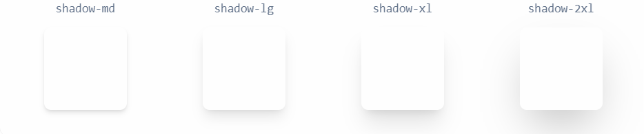
添加内阴影
使用
shadow-inner工具将微妙的内嵌框阴影应用于元素。这对于表单控件或井之类的东西很有用。
去除阴影
使用
shadow-none从元素中删除现有的框阴影。任意值:
shadow-[0_35px_60px_-15px_rgba(0,0,0,0.3)]==>box-shadow: 0 35px 60px -15px rgba(0,0,0,0.3)
2)阴影颜色
用于控制盒阴影颜色的工具。
使用 shadow-* 工具更改现有框阴影的颜色。默认情况下,彩色阴影的透明度为 100%,但你可以使用透明度修饰符对其进行调整。
| 类 | 解释 | 属性 |
|---|---|---|
| shadow-* 例子: shadow-black | * 可取值为 tailwindcss 设置的颜色关键字。 | --tw-shadow-color: #000; |
| shadow-*-* | 第二个 * 为颜色亮度等级,数值越大,颜色越深,反之颜色越浅。 |
例子:
<button class="bg-cyan-500 shadow-lg shadow-cyan-500/50 ...">Subscribe</button>
<button class="bg-blue-500 shadow-lg shadow-blue-500/50 ...">Subscribe</button>
<button class="bg-indigo-500 shadow-lg shadow-indigo-500/50 ...">Subscribe</button>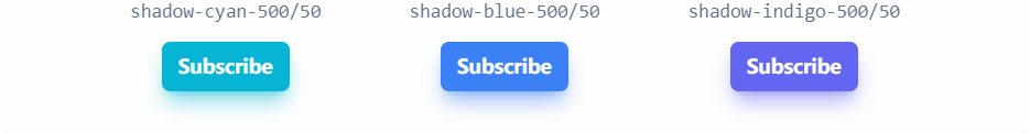
3. 盒子环
听着高大上,其实就是 tailwindcss 给盒子内置的阴影样式。
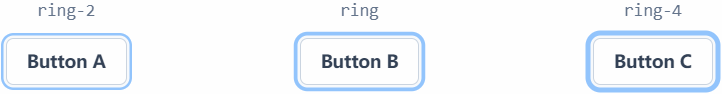
上图中,黑色是设置的元素边框,蓝色是设置的阴影,因为阴影围绕元素,所以叫盒子环。
1)环宽
用于创建带有框阴影的轮廓环的工具。
添加戒指
使用
ring-*工具将特定厚度的实心框阴影应用于元素。默认情况下,环是半透明的蓝色,类似于许多系统中的默认聚焦环样式。嵌环
使用
ring-inset工具强制在元素内部而不是外部渲染环。这对于屏幕边缘的元素很有用,因为在这些元素中环的一部分是不可见的。例子:html<button class="... ring-2 ring-pink-300 ring-inset"> Save Changes </button>
任意值:
ring-[10px]
2)环颜色
用于设置轮廓环颜色的工具。
使用 shadow-* 工具更改现有框阴影的颜色。默认情况下,彩色阴影的透明度为 100%,但你可以使用透明度修饰符对其进行调整。
| 类 | 解释 | 属性 |
|---|---|---|
| ring-* 例子: ring-black | * 可取值为 tailwindcss 设置的颜色关键字。 | --tw-ring-color: rgb(0 0 0 / var(--tw-ring-opacity, 1)); |
| ring-*-* | 第二个 * 为颜色亮度等级,数值越大,颜色越深,反之颜色越浅。 |
任意值:ring-[#50d71e]
第五章:CSS 高级技巧
一、元素可见性
1. 透明度
使用 opacity-* 工具来控制元素的透明度。* 取值为数字,具体可以参考官方文档。
任意值:opacity-[<value>] ==> opacity: <value>;
2. visibility
| 类 | 属性 |
|---|---|
| visible | visibility: visible; |
| invisible | visibility: hidden; |
二、溢出
1. overflow
| 类 | 属性 |
|---|---|
| overflow-auto | overflow: auto; |
| overflow-hidden | overflow: hidden; |
| overflow-visible | overflow: visible; |
| overflow-scroll | overflow: scroll; |
| overflow-x-auto | overflow-x: auto; |
| overflow-y-auto | overflow-y: auto; |
| overflow-x-hidden | overflow-x: hidden; |
| overflow-y-hidden | overflow-y: hidden; |
| overflow-x-visible | overflow-x: visible; |
| overflow-y-visible | overflow-y: visible; |
| overflow-x-scroll | overflow-x: scroll; |
| overflow-y-scroll | overflow-y: scroll; |
三、表单
第六章:布局
一、定位
1. display
| 类 | 属性 |
|---|---|
| block | display: block; |
| inline-block | display: inline-block; |
| inline | display: inline; |
| flex | display: flex; |
| inline-flex | display: inline-flex; |
| flow-root | display: flow-root; |
| grid | display: grid; |
| inline-grid | display: inline-grid; |
| hidden | display: none; |
2. position
| 类 | 属性 |
|---|---|
| static | position: static; |
| relative | position: relative; |
| absolute | position: absolute; |
| sticky | position: sticky; |
| fixed | position: fixed; |
3. left / right / top / bottom
-*: * 为数字。
-分子/分母:百分数。
-full:100%
4. z-index
| 类 | 解释 | 属性 |
|---|---|---|
| z-* 例子:z-10 | * 为 tailwind 设置的数字。 | z-index: 10; |
| z-auto | z-index: auto; |
任意值:z-[<value>] ==> z-index: <value>
使用负值时在最前面加上
-即可。
二、浮动
1. float
| 类 | 属性 |
|---|---|
| float-right | float: right; |
| float-left | float: left; |
| float-none | float: none; |
2. clear
| 类 | 属性 |
|---|---|
| clear-left | clear: left; |
| clear-right | clear: right; |
| clear-both | clear: both; |
| clear-none | clear: none; |
三、flex
1. flex 容器
1)flex-direction
| 类 | 属性 |
|---|---|
| flex-row | flex-direction: row; |
| flex-row-reverse | flex-direction: row-reverse; |
| flex-col | flex-direction: column; |
| flex-col-reverse | flex-direction: column-reverse; |
2)flex-wrap
| 类 | 属性 |
|---|---|
| flex-wrap | flex-wrap: wrap; |
| flex-wrap-reverse | flex-wrap: wrap-reverse; |
| flex-nowrap | flex-wrap: nowrap; |
3)justify-content
| 类 | 属性 |
|---|---|
| justify-normal | justify-content: normal; |
| justify-start | justify-content: flex-start; |
| justify-end | justify-content: flex-end; |
| justify-center | justify-content: center; |
| justify-between | justify-content: space-between; |
| justify-around | justify-content: space-around; |
| justify-evenly | justify-content: space-evenly; |
| justify-stretch | justify-content: stretch; |
4)align-items
| 类 | 属性 |
|---|---|
| items-start | align-items: flex-start; |
| items-end | align-items: flex-end; |
| items-center | align-items: center; |
| items-baseline | align-items: baseline; |
| items-stretch | align-items: stretch; |
5)align-content
| 类 | 属性 |
|---|---|
| content-normal | align-content: normal; |
| content-center | align-content: center; |
| content-start | align-content: flex-start; |
| content-end | align-content: flex-end; |
| content-between | align-content: space-between; |
| content-around | align-content: space-around; |
| content-evenly | align-content: space-evenly; |
| content-baseline | align-content: baseline; |
| content-stretch | align-content: stretch; |
2. flex 项
1)align-self
| 类 | 属性 |
|---|---|
| self-auto | align-self: auto; |
| self-start | align-self: flex-start; |
| self-end | align-self: flex-end; |
| self-center | align-self: center; |
| self-stretch | align-self: stretch; |
| self-baseline | align-self: baseline; |
2)order
| 类 | 解释 | 属性 |
|---|---|---|
| order-* 例子: order-6 | * 可取值 1 ~ 12 | order: 6; |
| order-first | order: -9999; | |
| order-last | order: 9999; | |
| order-none | order: 0; |
任意值:order-[<value>] ==> order: <value>
3)flex-basis
固定宽度:basis-*
百分比宽度:basis-分子/分母、basis-full
任意值:basis-[value] ==> flex-basis: <value>
4)flex-grow
| 类 | 属性 |
|---|---|
| grow | flex-grow: 1; |
| grow-0 | flex-grow: 0; |
任意值:grow-[value] ==> flex-grow: <value>
5)flex-shrink
| 类 | 属性 |
|---|---|
| shrink | flex-shrink: 1; |
| shrink-0 | flex-shrink: 0; |
任意值:shrink-[value] ==> flex-grow: <value>
6)flex
| 类 | 属性 |
|---|---|
| flex-1 | flex: 1 1 0%; |
| flex-auto | flex: 1 1 auto; |
| flex-initial | flex: 0 1 auto; |
| flex-none | flex: none; |
任意值:flex-[2_2_0%] ==> flex: 2 2 0%
第七章:响应式设计
1. 断点
| 断点前缀 | 最小宽度 | CSS |
|---|---|---|
sm | 640px | @media (min-width: 640px) { ... } |
md | 768px | @media (min-width: 768px) { ... } |
lg | 1024px | @media (min-width: 1024px) { ... } |
xl | 1280px | @media (min-width: 1280px) { ... } |
2xl | 1536px | @media (min-width: 1536px) { ... } |
2. 针对断点范围 / 针对单个断点
默认情况下,由 md:flex 等规则应用的样式将应用于该断点并在较大的断点处保持应用。
| 修饰符 | 媒体查询 |
|---|---|
max-sm | @media not all and (min-width: 640px) { ... } |
max-md | @media not all and (min-width: 768px) { ... } |
max-lg | @media not all and (min-width: 1024px) { ... } |
max-xl | @media not all and (min-width: 1280px) { ... } |
max-2xl | @media not all and (min-width: 1536px) { ... } |
如果你只想在特定断点范围处于活动状态时应用工具,请将响应式修饰符(如 md)与 max-* 修饰符堆叠在一起,以将该样式限制在特定范围内:
<!--
  md:max-xl:flex 解释
    只在中等屏幕 (md) 到超大屏幕 (xl) 之间应用 display: flex
    生效范围: 768px ≤ 屏幕宽度 < 1280px
-->
<div class="md:max-xl:flex">
  <!-- ... -->
</div>第八章:特效
一、形变
二、动画
三、
第九章:定制化
默认情况下,Tailwind 将在项目的根目录中查找可选的 tailwind.config.js 文件,可以在其中定义任何自定义项。
一、配置
1. Content
content 部分是配置所有 HTML 模板、JS 组件和任何其他包含 Tailwind 类名称的文件的路径的地方。